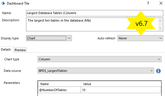
I was inspired to share some thoughts around Blue Prism’s Analytics module having recently upgraded an environment to 6.7 and subsequently checked out the new “Line” chart type. For those readers unfamiliar with Blue Prism’s Analytics it is a module to help visualize data graphically in the form of charts; Pie, Doughnut, Bar, Column, Gauge and now Line.
Visualising your data is an effective way to summarize, analyse, kick start discussions, cost-assess, fine-tune, improve and ultimately understand how your automations are performing. In this article I will take you on a tour of the Analytics module and show potential use cases based on “Work Queues”. A more advanced route is to push this data out to a specialist business intelligence (BI) application (e.g. Splunk, Kibana, Power BI) and Blue Prism does support this option in the form of Data Gateways. This is out of scope for this article. I will take an inward look at to what is possible within the Blue Prism application itself. Whilst the Analytics module is quite rudimentary by comparison with the specialist systems, it is still a good starting point for those without an advanced BI framework already in place.
Analytics Overview
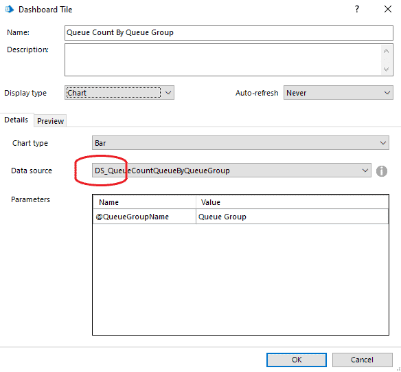
Everything is centred around a “Tile”. Each saved Tile is a configuration of a Chart type and Data source with optional parameters. Blue Prism provide some example “out-of-the-box” Tiles to get started but they are not comprehensive by any means. As we have come to expect from Blue Prism’s extensible nature, it is possible to build your own requiring only a degree of creativity and database development expertise.
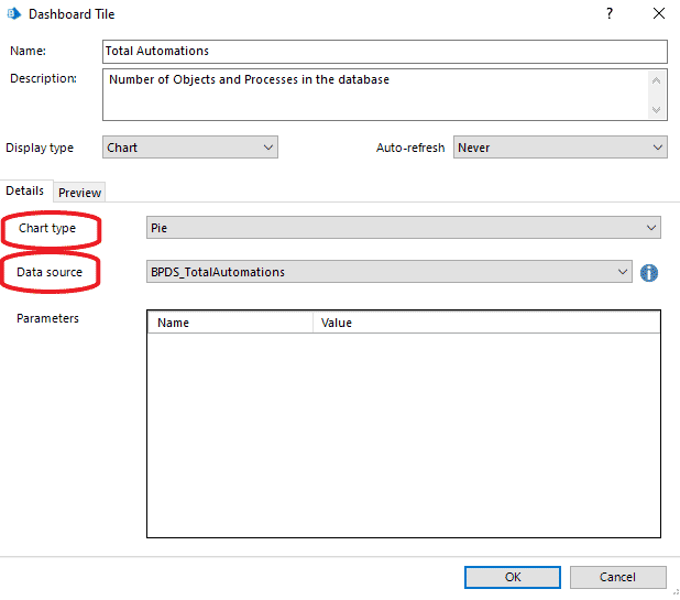
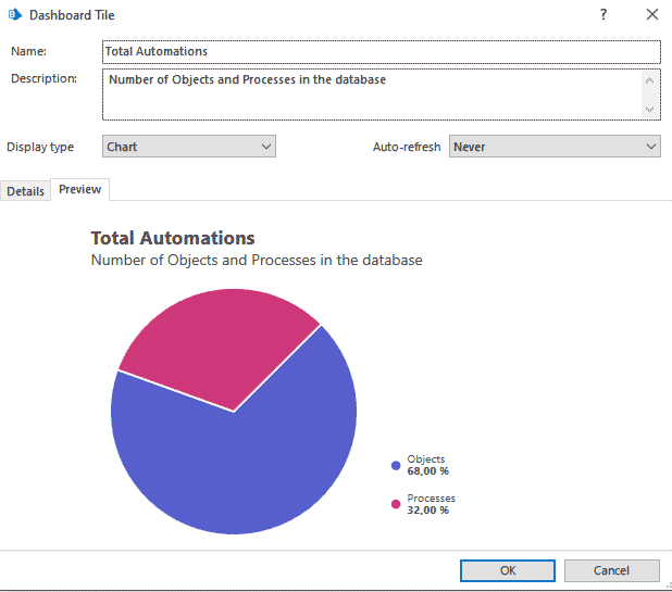
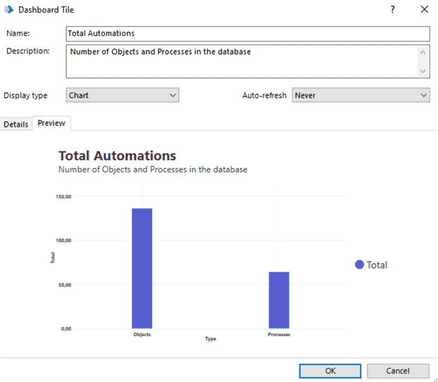
Changing the chart type will give you a different visual effect over the same data.
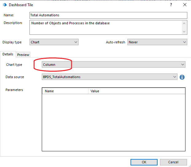
Different data contents lend themselves better to different chart types. Experiment to find a suitable graphic for your needs. The Chart types can not be added to and include: –
- Bar
- Stacked Bar
- Column
- Stacked Column
- Pie
- Doughnut
- Gauge
- Line
The Data source list contains Blue Prism’s own “Stored Procedures” recognised by the naming convention “BPDS_”. In order to add “custom” data sources it is necessary to write a stored procedures to the database with the naming convention “DS_”.
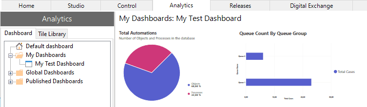
Multiple tiles are pulled together into a “Dashboard”. 3 Categories of Dashboard allow for your own personal use (My Dashboard), all users (Global) and exposure to Data Gateways (Published). Missing functionality that I expect to be added in a future Blue Prism release is support for Multi-team environments. This would look something like sub-folders, under the Global Dashboards folder, that are linked to “Access Rights”. This concept is present in other areas of the system and would effectively grant access to Dashboards by User Group.
Analytics Usage
How can Dashboards be used and by whom? Automation projects can involve many different people with different areas of responsibility. Gathering the data of interest for the project team and business users into Tiles and creating a Dashboard for them can not only help with the overall success of the project as it unfolds but provide critical information on where to focus moving forward.
- Infrastructure: Database and Virtual Machine information can be collated for the IT teams to help maintain and support these critical components.
- Developers/Release managers: Showing the Processes / Business Objects that have been modified in the development environment since the last release will help ensure the next release package is complete. In a production environment this same report can highlight “hot fixes” that need to be merged back into development.
- Process controllers: Displaying the current live exceptions and case information approaching SLA deadlines will help those responsible keep the processes data flowing.
- Process analysts: Summarising key statistics about case working time, averages, exception rates over specified time ranges can assist those responsible for performance monitoring the automations.
- Process owners: A holistic view over a given period for total numbers of cases, total worked time, time saved, percent handled without manual intervention is good information for the head of RPA / business units to report upwards the effectiveness of the automations.
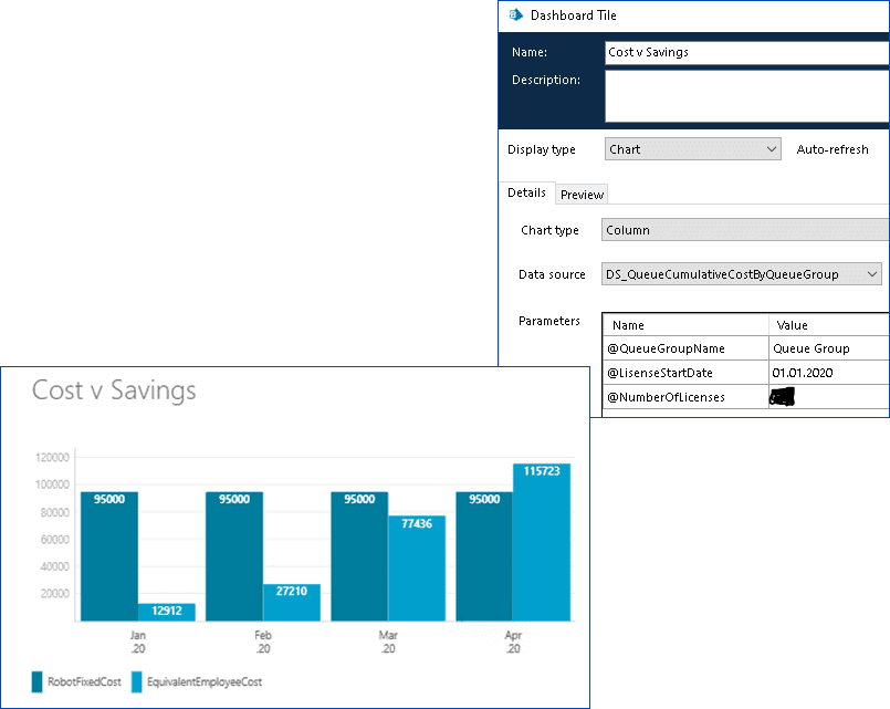
- Stakeholders: The return on investment (ROI) drives many RPA projects and a simple line diagram of cost versus savings can make a strong argument for further investment for those that ultimately sign off on the yearly budgets.
Work Queue Deep Dive
Blue Prism automations are underpinned by the Work Queue. A storage layer for case data, its status during the case lifecycle and any optional tagged information. Points 4, 5 and 6 above are particularly relevant for this section. Let us take a closer look at some example Tiles built around Work Queues.
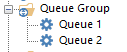
These examples will reference an abstract data set that has no real meaning just to illustrate the points. We will work with 2 queues; Queue 1 and Queue 2 that both belong to a Queue Group.
All items on a Work Queue start with a data set, the Item Data Collection, that is often appended to with data from the relevant systems as the process runs.
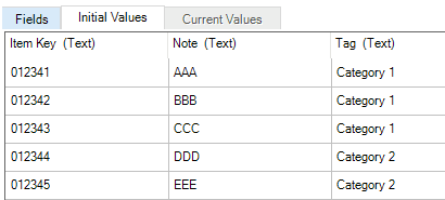
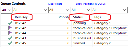
This data is only available from the process whilst the process is running and therefore not strictly visible on the Work Queue itself…with some exceptions. The Item Key is used as the unique reference for the case and is visible on the Work Queue. The Work Queue Status tracks the progress of an item throughout its lifecycle. Finally, any other case data can be “Tagged” during the running of a process thereby exposing it up to the Work Queue Tags.
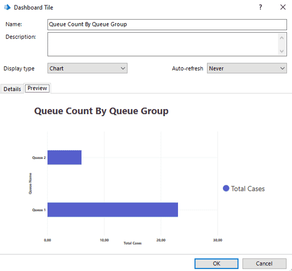
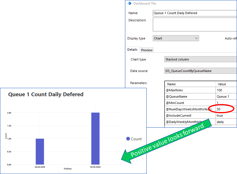
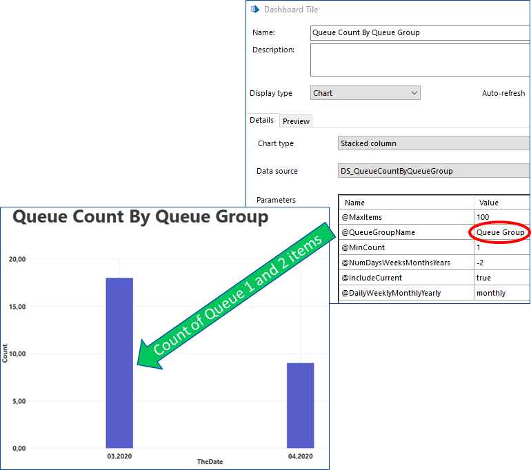
Lets start simple and look at a Tile that gives a count of items on a queue.
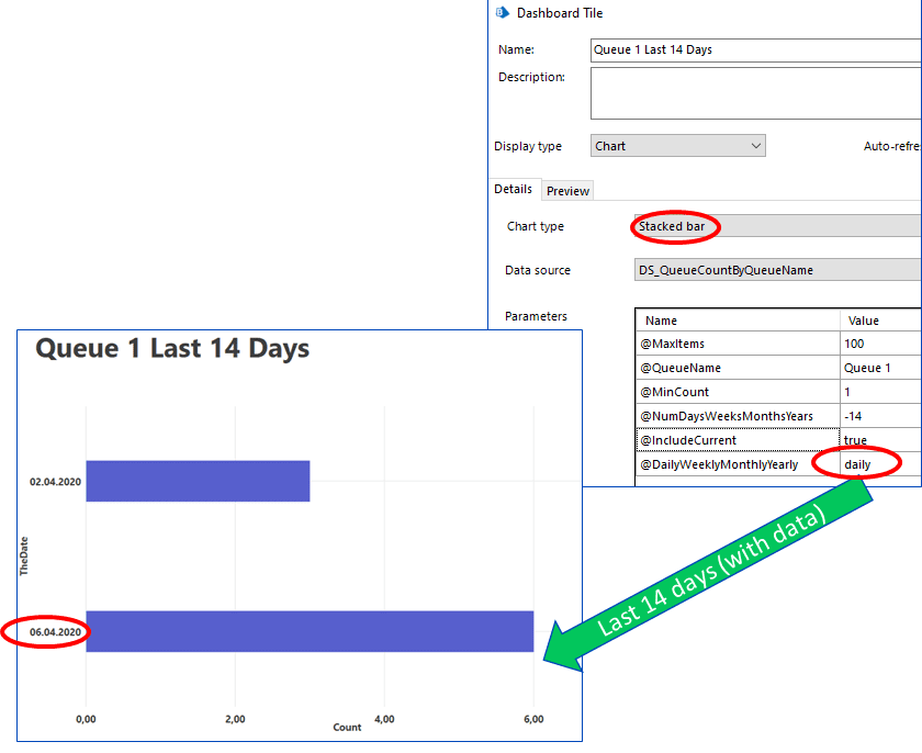
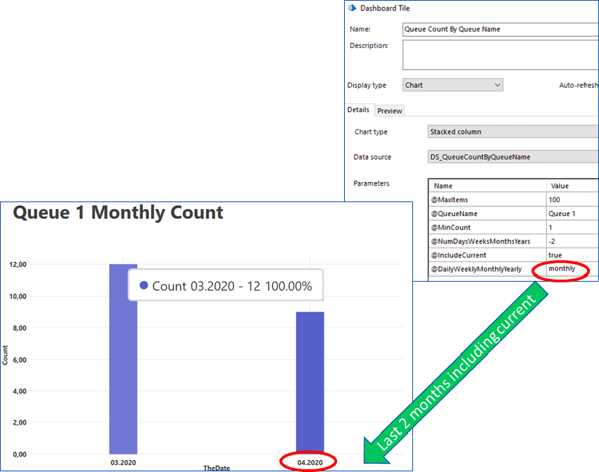
This Tile aggregates the total number of cases daily, weekly, monthly or yearly based on the parameter values specified. Changing the configuration on the same Data source gives a different view
Work Queues have a historic and future context given that items placed on the queue can be deferred for processing to a date and time in the future. Flipping the sign of the @NumDaysWeeksMonthsYears parameter will look forward in time reporting the deferred cases that are yet to be processed.
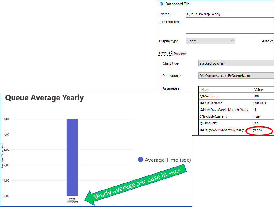
The amount of time used by an automation is a commonly requested metric and should be displayed at the granularity that is relevant to the processing time of that automation. The display unit options are seconds, minutes, hours and days.

Analysing how much time is used on average for all cases on a queue might give an insight into the underlying system performance and/or the effectiveness of the process development.
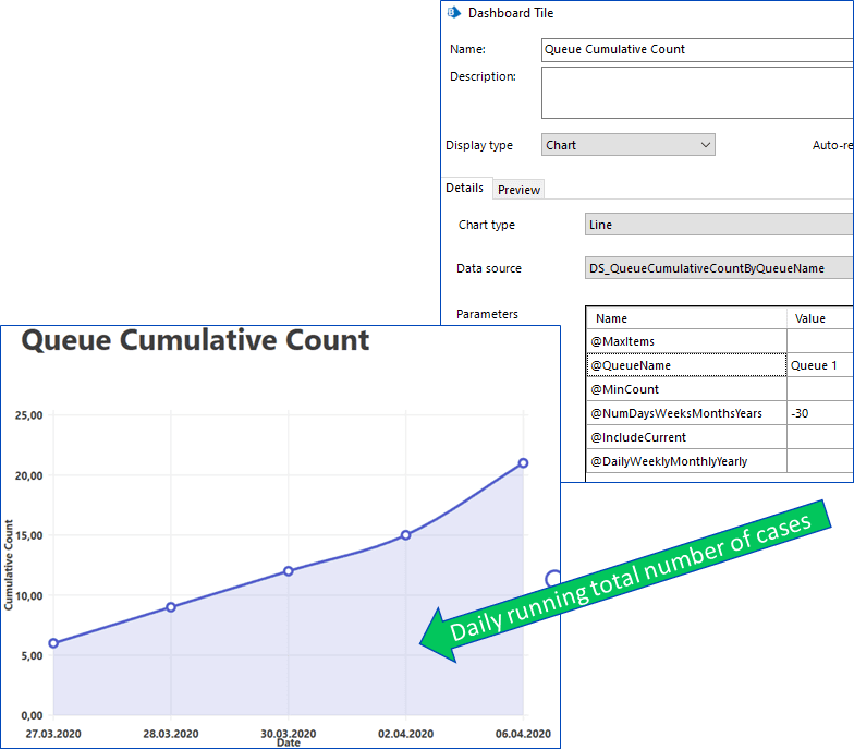
Cumulative Tiles show the totals over a given period – the new Line chart type comes into its own for this type of data.
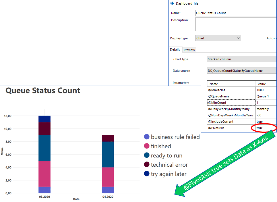
So far, the Tiles have been representing just 2 axes, time plus one another (count, duration, average, etc). Let us introduce an additional dimension to the data, Queue Status, to show how this can change the look of the charts.
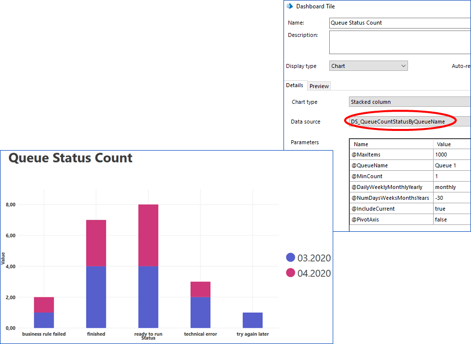
Now we are stacking the data to represent the months as colours and the statuses as individual bars. What about if we wanted to pivot this view to show the months as bars, and the statuses as colours? In Blue Prism versions 6.6 and below there was an in-built toggle that catered for just that very function.

This has been removed by design in version 6.7 due to an underlying framework change.
However, it is still achievable to pivot the data by changing the parameter values in the Tile.
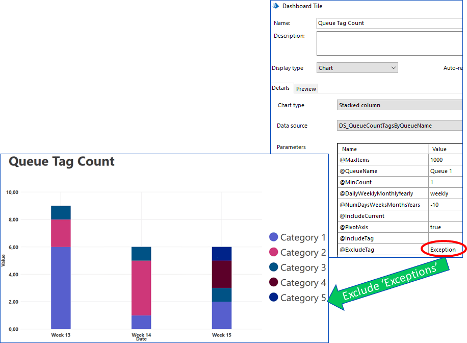
One of the most powerful Tiles comes with the ability to display all of the above metrics by filtered Tags.
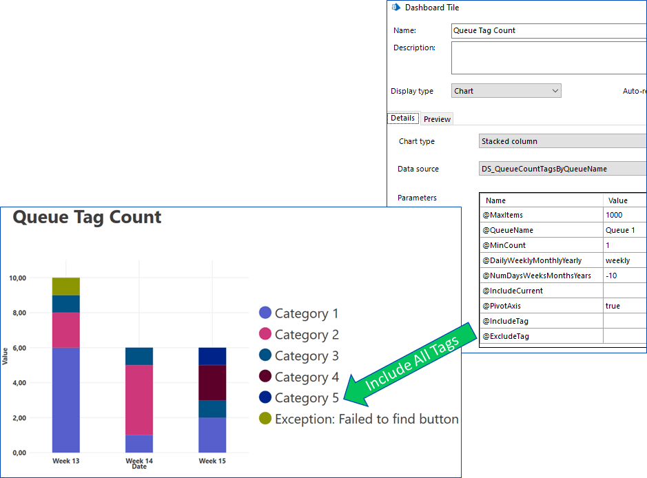
Given multiple Tags are possible on a single queue item it is also convenient to filter in and filter out Tags by a text value.
Often it is logical to place Work Queues into Work Queue Groups. The above Tiles are also available at the Queue Group level whereby the data is aggregated for all queues within the group – even nested groupings.
Finally, a Tile that can display the financial gains associated to an automation initiative. A monthly view of the fixed costs associated with a specified number of licenses versus the savings made through automatic processing.
Conclusion
Blue Prism has its own Analytics module that can be developed and configured to give simple graphical representations of the underlying data. Whilst there are more sophisticated business intelligent systems available on the market that can be integrated with Blue Prism, the Analytics module is a good cost- effective starting point. It is architecturally very close to the data and therefore gives a “live” view.
Work Queues are a key component for most Blue Prism automations. Having available a flexible set of Tiles that can provide useful data views as Dashboards to all interested parties will boost your automation initiative. All Ren Røros Intelligent Automation customers receive our standard pack of Tiles, accompanying documentation and training for usage.